
ToroToro Group Project
Spark Brief
The Brief:
Come up with an interactive promotion method(s) that celebrates the transformative power of 5G technology in everyday life, unlocking boundless possibilities for our interconnected world. As the fifth generation of wireless technology, 5G offers lightning-fast downloads, minimal latency, extensive connectivity, and unparalleled reliability. Our focus is on Rangatahi—the dynamic youth and future leaders of Maori communities. Inspire Rangatahi to recognize the vast potential of creative technology, empowering them to become the trailblazers, decision-makers, and eventual guardians of tomorrow. Through compelling narratives, weave stories of 5G technology bridging connections between the land and its people, fostering innovation and community engagement.
Our Response:
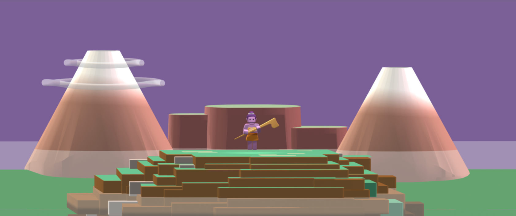
ToroToro is a coding game, with a storyline inspired by three Māori legends. The game aims to serve as an exciting first introduction to programing for Rangatahi. ToroToro introduces basic concepts through engaging gameplay helping to integrate cultural identity and contextual learning into tech education.
Promotional Collateral Mockups
Purpose :
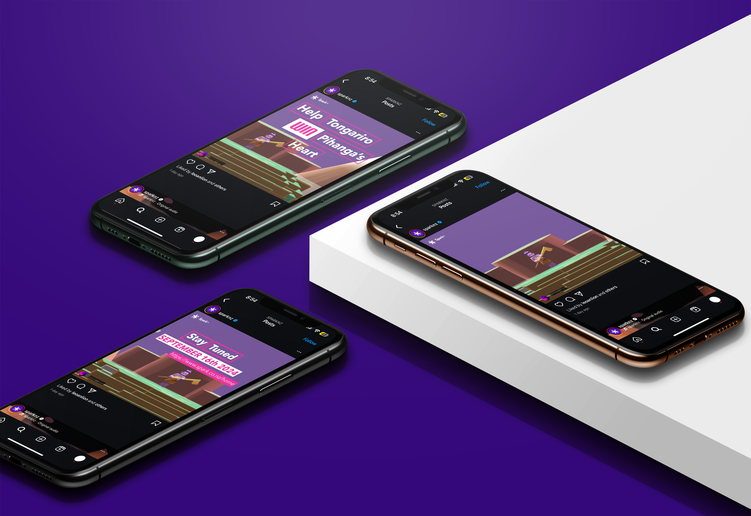
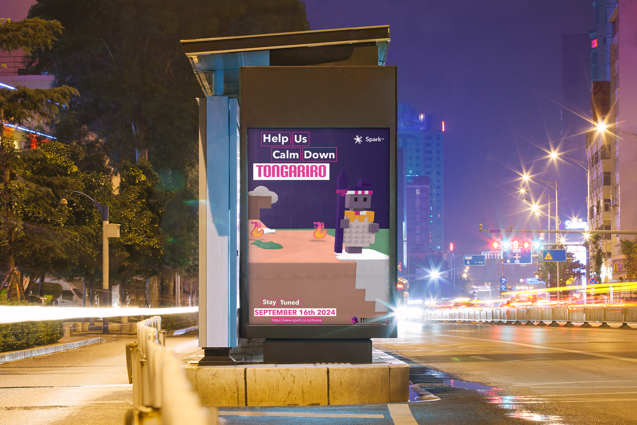
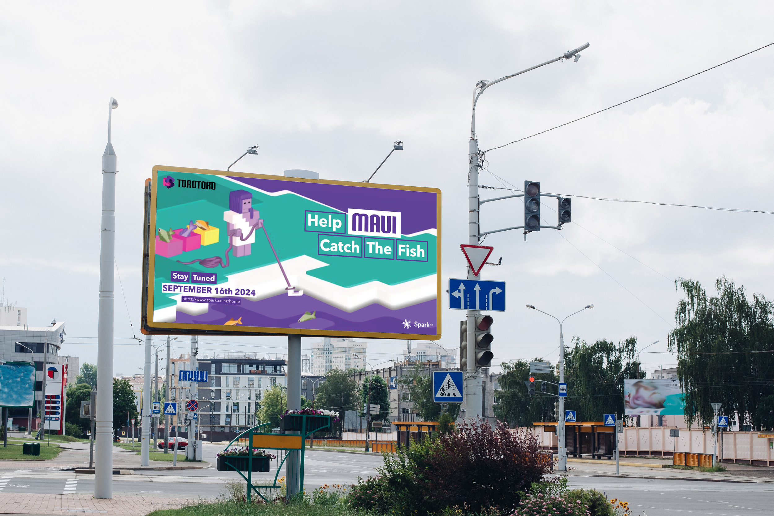
To effectively reach our target audience, we developed a range of informative collateral, including posters, billboards, and social media advertisements. High-quality mock-ups were produced for each piece to help visualize how the designs would appear in real-world contexts.
Skills :
Layout
Typography
Colour Analysis
Negative Space
Hierarchy
Character Design:
Purpose:
Virtual prizes were developed for players to claim upon completing each level. Here, you can see sketches of stickers that players can exchange in text conversations with their peers and whānau. These stickers are designed to convey emotions in a fun, modern way while reaffirming rangatahi's cultural identity.
Skills:
Character Design and Illustration
Digital Asset Creation
User Experience (UX) Design

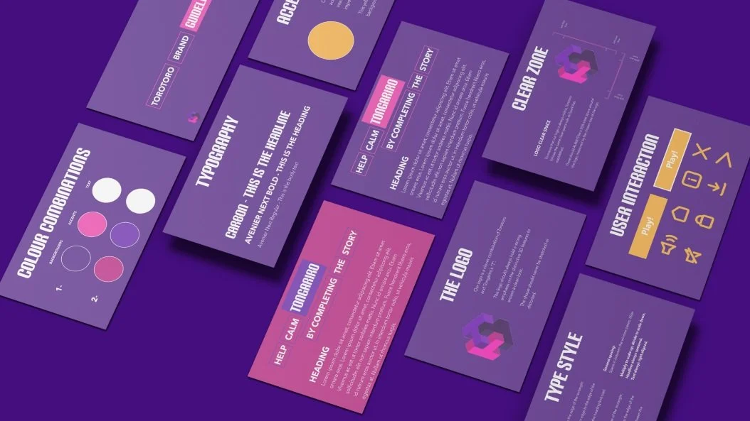
Branding :
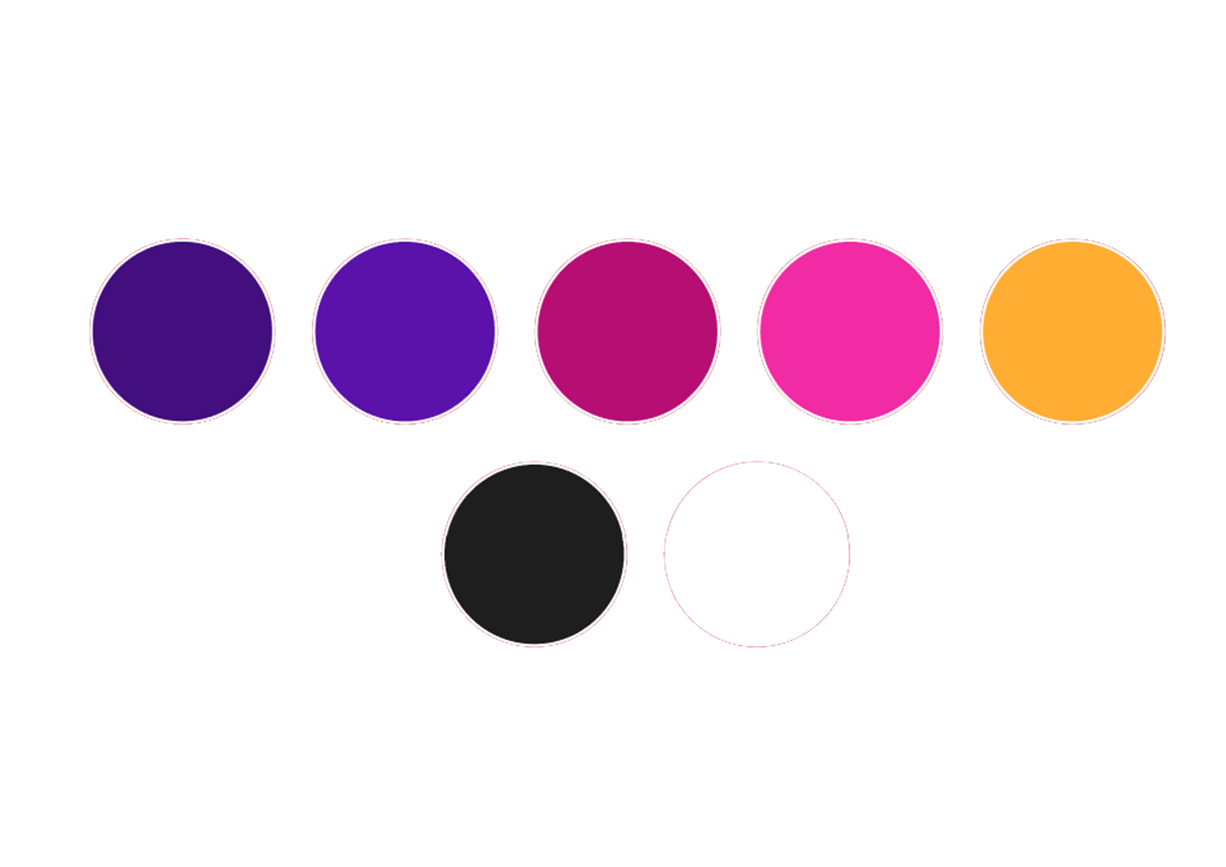
Colour Scheme

Typography
Logo Animation
The Torotoro logo was intentionally designed with simplicity in mind, ensuring strong brand recognition and clarity across a range of digital platforms.
The logo animation uses minimal motion to maintain versatility and adaptability in various digital contexts.
Logo Ideation :
-
![]()
Logo 1
-
![]()
Logo 2
-
![]()
Logo 3
-
![]()
Logo 4
-
![]()
Logo 5
-
![]()
Final Logo


Flaws in Logos 1-5 :
Logo One: Looked unfinished; lacked refinement and looks like a sketch.
Logo Two: Too plain; lacked visual interest or distinctiveness.
Logo Three: Visually overwhelming; too many colours, became distracting.
Logo Four: Colors blended together; lacked contrast and clarity.
Logo Five: Flame details are too bright; distracted from the main elements, the “T”
Solution :
In the final logo design, the use of contrasting tones within the same color group helped to maintain clarity and cohesion. The patterns were removed to prevent the logo becoming visually overwhelming, ensuring that key elements remain clear and easily recognizable.